Branding
Sterling and Hunter
Sterling and Hunter
A refined brand identity for a cross-border accountancy and advisory firm, combining British heritage with real experience of doing business in the UAE.
Year :
2026
Industry :
Accountancy
Client :
Sterling and Hunter
Project Duration :
3 weeks

The Brief
The balance was really important with this one.
Sterling & Hunter needed to feel established, credible and premium, without becoming overly corporate or losing the people behind it. The aim was to create something clients could immediately trust, while working just as naturally in the UK as it does in the UAE.

The Approach
The identity brings together heritage, trust and a more personal side of professional services:
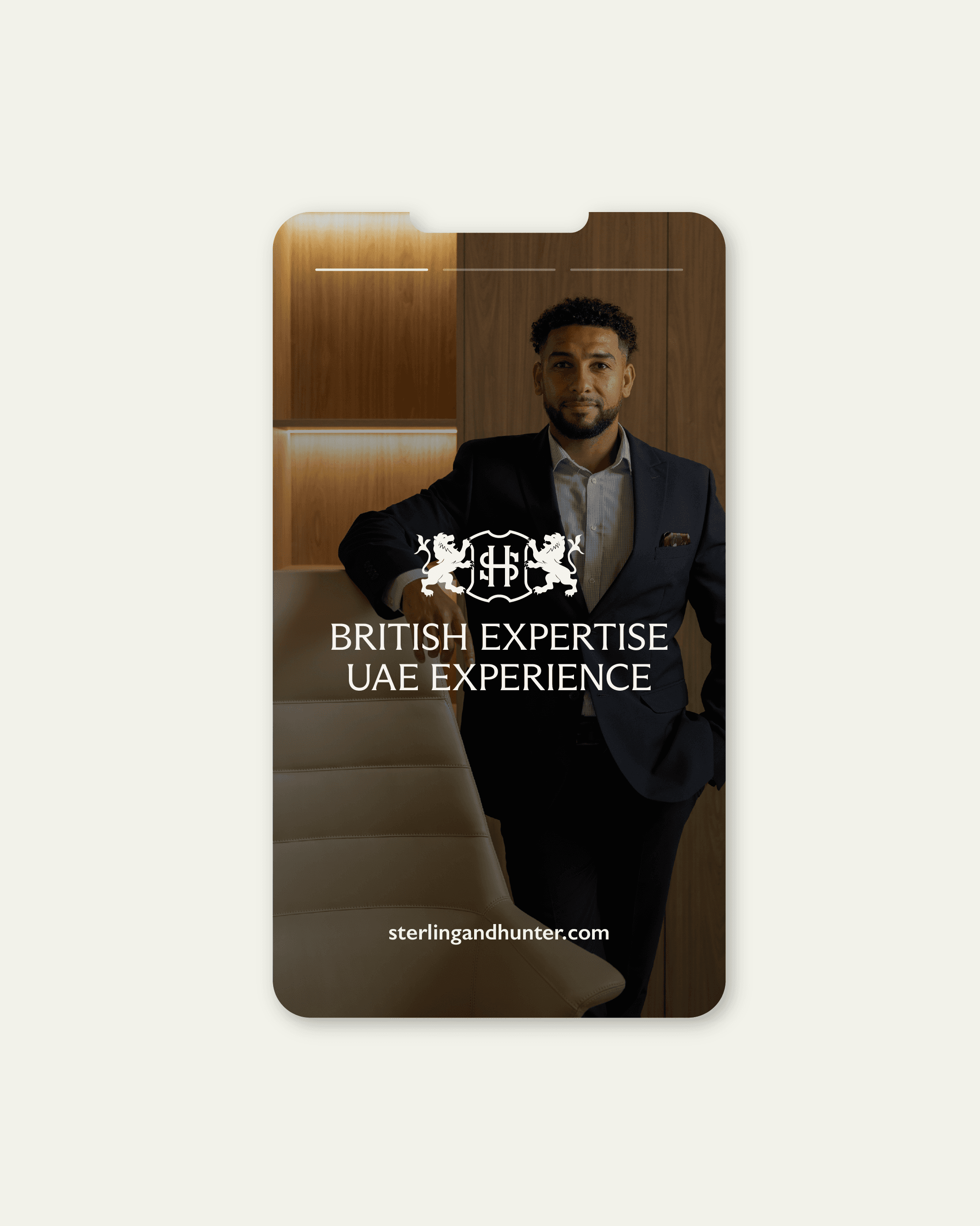
The S&H initials sit within a traditional heraldic shield, with two lions representing strength, confidence and protection, a subtle nod to the brand’s British and Scottish roots.
A series of logo treatments gives the identity flexibility across digital, print and more formal applications while keeping the brand instantly recognisable.
Windsor Blue and Alabaster create an established, professional foundation, with Sterling Gold adding warmth and Stone Wall bringing a softer, grounded quality.
Arizona Flare introduces character and a sense of heritage, balanced by Gill Sans to keep the wider identity clean, contemporary and approachable.
If you're really interested, be sure to check out this video which brings to life my approach and thinking behind Sterling & Hunter.


The Outcome
Sterling & Hunter now has an identity that feels established without feeling dated, and premium without becoming impersonal. It brings together British heritage and real UAE experience to create a brand built around credibility, confidence and trust.




More Projects


Branding
Sterling and Hunter
Sterling and Hunter
A refined brand identity for a cross-border accountancy and advisory firm, combining British heritage with real experience of doing business in the UAE.
Year :
2026
Industry :
Accountancy
Client :
Sterling and Hunter
Project Duration :
3 weeks
The Brief
The balance was really important with this one.
Sterling & Hunter needed to feel established, credible and premium, without becoming overly corporate or losing the people behind it. The aim was to create something clients could immediately trust, while working just as naturally in the UK as it does in the UAE.
The Approach
The identity brings together heritage, trust and a more personal side of professional services:
The S&H initials sit within a traditional heraldic shield, with two lions representing strength, confidence and protection, a subtle nod to the brand’s British and Scottish roots.
A series of logo treatments gives the identity flexibility across digital, print and more formal applications while keeping the brand instantly recognisable.
Windsor Blue and Alabaster create an established, professional foundation, with Sterling Gold adding warmth and Stone Wall bringing a softer, grounded quality.
Arizona Flare introduces character and a sense of heritage, balanced by Gill Sans to keep the wider identity clean, contemporary and approachable.
If you're really interested, be sure to check out this video which brings to life my approach and thinking behind Sterling & Hunter.
The Outcome
Sterling & Hunter now has an identity that feels established without feeling dated, and premium without becoming impersonal. It brings together British heritage and real UAE experience to create a brand built around credibility, confidence and trust.
More Projects
Branding
Sterling and Hunter
Sterling and Hunter
A refined brand identity for a cross-border accountancy and advisory firm, combining British heritage with real experience of doing business in the UAE.
Year :
2026
Industry :
Accountancy
Client :
Sterling and Hunter
Project Duration :
3 weeks
The Brief
The balance was really important with this one.
Sterling & Hunter needed to feel established, credible and premium, without becoming overly corporate or losing the people behind it. The aim was to create something clients could immediately trust, while working just as naturally in the UK as it does in the UAE.
The Approach
The identity brings together heritage, trust and a more personal side of professional services:
The S&H initials sit within a traditional heraldic shield, with two lions representing strength, confidence and protection, a subtle nod to the brand’s British and Scottish roots.
A series of logo treatments gives the identity flexibility across digital, print and more formal applications while keeping the brand instantly recognisable.
Windsor Blue and Alabaster create an established, professional foundation, with Sterling Gold adding warmth and Stone Wall bringing a softer, grounded quality.
Arizona Flare introduces character and a sense of heritage, balanced by Gill Sans to keep the wider identity clean, contemporary and approachable.
If you're really interested, be sure to check out this video which brings to life my approach and thinking behind Sterling & Hunter.
The Outcome
Sterling & Hunter now has an identity that feels established without feeling dated, and premium without becoming impersonal. It brings together British heritage and real UAE experience to create a brand built around credibility, confidence and trust.